Spatial UI
Monument Valley-inspired interfaces for games and immersive experiences.
- Floating orbs & 3D layouts
- Minimal text, maximum gesture
- Context-aware animations
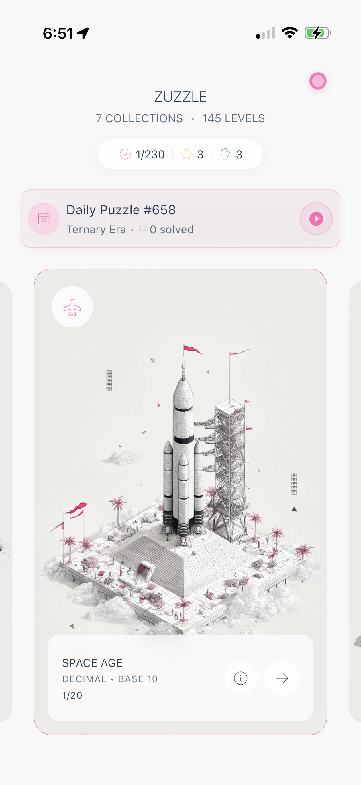
- Zuzzle (number-systems puzzles)
The Zovia Design System
A mobile-first design system powering all Zovia apps.
43
Packages
2
Paradigms
100%
Phone-Only
Philosophy
Technology should disappear. Users shouldn't think about the interface, they should think about their content.
Remove before you add
Animation explains change
Color indicates state
44×44pt minimum targets
Glassmorphism hierarchy
Learn once, use everywhere
Our design system draws on two of the most studied design languages in the world: Apple's Human Interface Guidelines and Google's Material. We took the parts that fit a calm, focused product and refined them into our own token-driven system: a single palette, a quiet type scale with no bold weights, consistent motion, and contrast checked everywhere.
Two paradigms
Two visual languages. Same logic. Different expressions.
Monument Valley-inspired interfaces for games and immersive experiences.
Familiar patterns for productivity apps and information-dense screens.
CLAUDE.md Rule 9
Every screen in every Zovia app uses the same chrome stack. No deviations across existing, new, or future apps.
Floating glass top island. Set useGlassAppBar: true.
Floating glass bottom nav when present. Set useGlassBottomNav: true.
Body extends edge-to-edge under chrome so glass blurs items and the top fade dissolves cleanly.
accentColor drives the atmosphere drawn behind the body. Never replace with a flat background.
The canonical top spacer (status bar + bar height). Using glassAppBarHeight alone clips items mid-fade.
Rule 9, absolute
If the system doesn't fit a real need, fix ZAppScaffold and roll it out across all apps in the same change. Never one-off it.
The Z Component Library
Every visual unit in a Zovia app is a Z atom. Raw Material widgets break the type ramp, the theme, and the cross-app consistency contract.
Never use raw Text(). Five styles (header, title, body, caption, micro) tuned to the Zovia type ramp.
Never use raw ElevatedButton or TextButton. ZButton handles brand color, contrast, and tier intent automatically.
Replaces ad-hoc icon-plus-label rows. Primary, secondary, ghost variants. The canonical CTA for modals.
Replaces tappable Text and TextButton for inline links. Small, medium, large sizes that match caption-scale type.
Replaces Container + BoxDecoration. Standard radius, padding, shadow, and theme-aware surface color.
Replaces showDialog and AlertDialog. The only sanctioned modal surface, auto-tracked by ZModalCoordinator.
Atoms for loading shimmer (line, circle, block). The escape hatch when a component skeleton doesn't fit.
Ambient signal surface. Preferred over permanent chrome for transient feedback. Never stacks, never blocks.
Compact status and category tag. Used for tier badges, filter chips, list metadata.
Horizontal scroll row with built-in alignment, edge fades, and snap behavior tuned to phone-only layouts.
Queues auto-firing modals so prompts never stack on top of each other. Required for any sheet not triggered by a direct tap.
Rule 11
Auto-firing modals (post-frame, timers, stream listeners, lifecycle callbacks) MUST wrap their show call with ZModalCoordinator.enqueue. Direct .show() from an auto-trigger stacks on top of any open modal.
Rule 12
Every button, CTA, and tappable text uses a Z component. Never reach for ElevatedButton, TextButton, OutlinedButton, FilledButton, or a tappable raw Text. The Z atoms are pre-tuned to the Zovia type ramp.
CLAUDE.md Rule 8
Blank screens and bare spinners are forbidden. Every visual component with a data-loaded lifecycle ships a static .skeleton() factory matching its shape.
A compliance test fails CI when a Z* widget lands without a .skeleton() factory or a /// @no-skeleton: explanation marker.
packages/z_design/test/skeleton_factory_compliance_test.dart
CLAUDE.md Rule 13
Every screen, feature, and interaction clears these ten. When proposing a design, name the two or three you are leaning on. When violating one, say which and why.
1
Every action shows a response within roughly 400ms. No "did anything happen?" gaps.
2
Primary tap targets at least 44pt, placed in the natural thumb zone. Never under glass-bar hit slop.
3
Every destructive action has undo (preferred) or explicit confirmation. No silent permanent destruction.
4
Inputs surface recent and likely options. Empty fields suggest, never blank.
5
Complex screens open with the 80% case visible. Advanced controls live behind "More" or expand.
6
Primary choice surfaces show no more than about 7 options at once. Beyond that, group, filter, or paginate.
7
Every flow has an intentional opening moment and a satisfying close. No flow ends by silently dropping back to a list.
8
Incomplete progress is visible when the user returns. Multi-step state never resets silently.
9
Multi-step flows show progress and visibly accelerate cues near completion.
10
Default to ambient signals (badges, color shifts, subtle cards). Reserve push and modal interruption for high-stakes events.
Full canon and rationale live in CLAUDE.md at the repo root.
Themes
Every component adapts automatically. All apps support both themes out of the box.
Palette
Tropical Rainforest Dawn • Coral Reef Depths
Morning Mist
#F8F6F2
Dew on Leaves
#E8E3DB
Fern Grove
#7A9179
Forest Ink
#2D3B2A
Leaf Text
#4A5D47
Mist Text
#7A8A77
Accent
#D97AA6
Success
#A8D6A8
Warning
#E67E22
Error
#E74C3C
Info
#00A5A8
Abyssal
#0A0F14
Deep Current
#121820
Mid Water
#1A222C
Parrotfish
#00CED1
Pearl Glow
#E6F3FF
Foam White
#B8D4EA
Staghorn Coral
#FF7F7F
Table Coral
#7FFFD4
Brain Coral
#FFB347
Sea Fan
#FF69B4
Angelfish
#FFD700
Type
Subtle, quiet text hierarchy. Built with SF Pro.
Header • 20pt • Light (300)
The quick brown fox jumps over the lazy dog
Title • 17pt • Light (300)
The quick brown fox jumps over the lazy dog
Body • 14pt • Regular (400)
The quick brown fox jumps over the lazy dog
Caption • 12pt • Regular (400)
The quick brown fox jumps over the lazy dog
Micro • 11pt • Regular (400)
THE QUICK BROWN FOX JUMPS OVER THE LAZY DOG
Icon set
Phosphor Icons. Exclusively.
Most apps mix icon sets, Material here, Font Awesome there, custom SVGs everywhere. This creates visual chaos. Users subconsciously notice the inconsistency.
We use Phosphor Icons exclusively across every screen, every app, every interaction in the Zovia ecosystem. No exceptions.
Why Phosphor? Because they understand what we understand: consistency is invisible, but its absence is jarring.
Thin weight for Monument Valley minimalism. Icons become geometry.
Thin weight for clarity and information density. Same default as games for cross-app consistency.
Thin is the Zovia default across all surfaces. Fill is explicitly avoided because it renders as a solid blob on light backgrounds.
Thin
Games
Light
Apps
Regular
Default
Bold
Emphasis
Fill
Avoided
Duotone
Depth
And hundreds more. Every interaction, every state, every screen.
The ecosystem
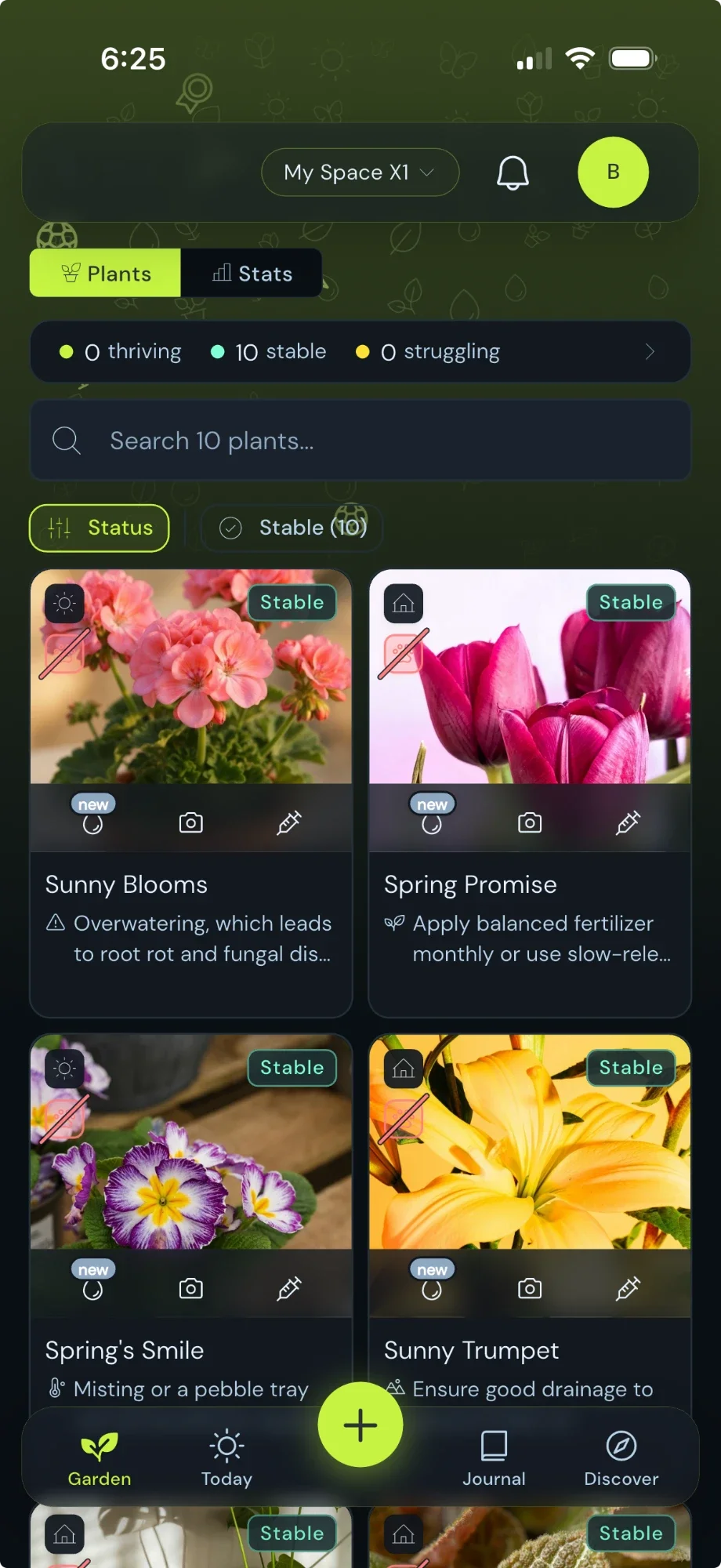
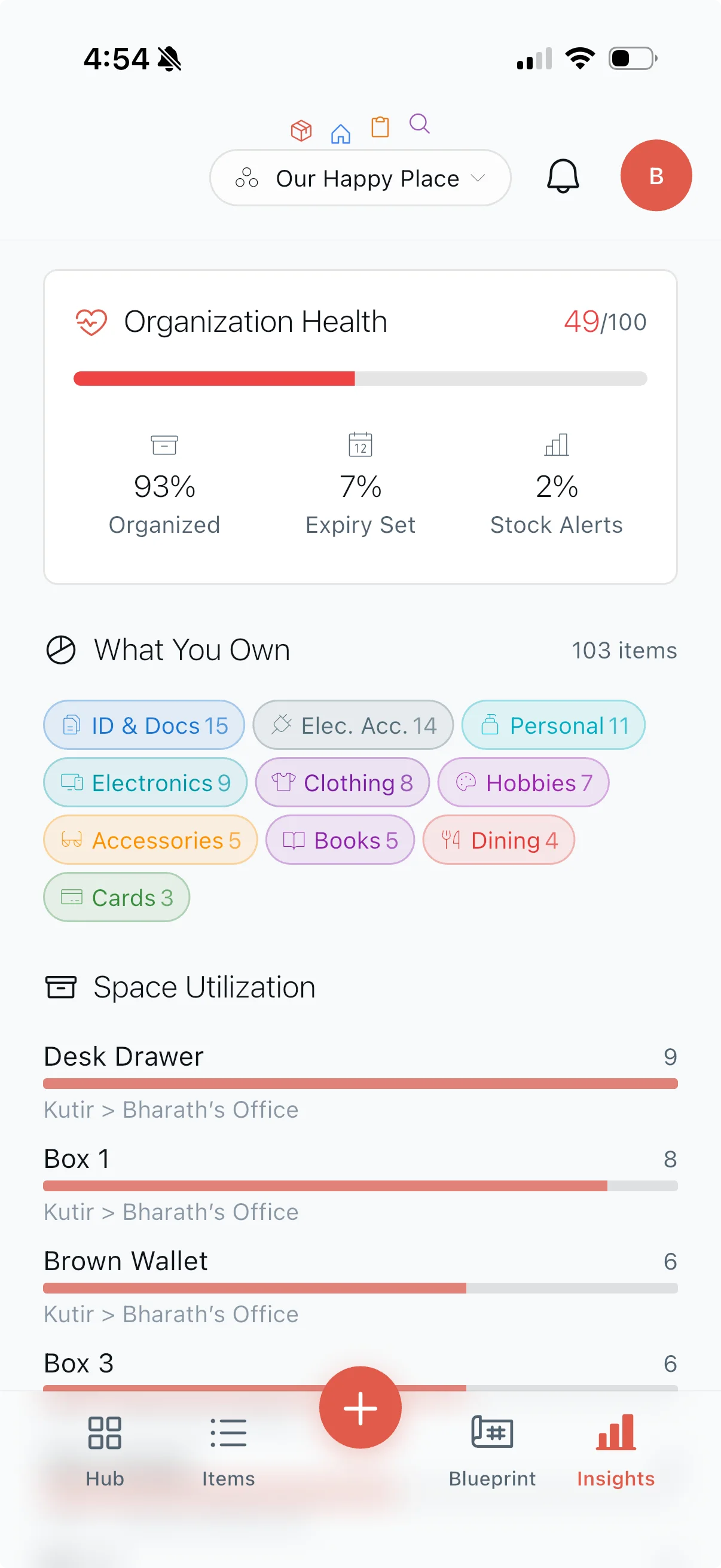
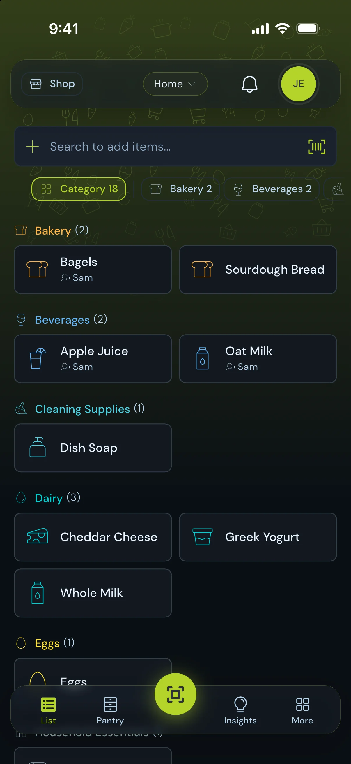
Used across the Zovia ecosystem
The grocery list that learns.
Family Calendar
Inventory Management
Counter & Schedule Tracker
Number System Puzzles
Plant care that thinks
Post your work. Get real critique.
Detective logic grid mysteries.
How well do you know your rights?
43 shared packages • 100% phone-only • Zero tablet code
Build your own
The Z component library ships as real source in Zovia Snapshot, alongside the backend layer and a Claude Code guide, so you can build your own app on the same foundation we use.